TIMELINE
1 1/2 years
MY ROLE
UX/UI Designer
TOOLS
Figma, Miro
ABOUT THE COMPANY
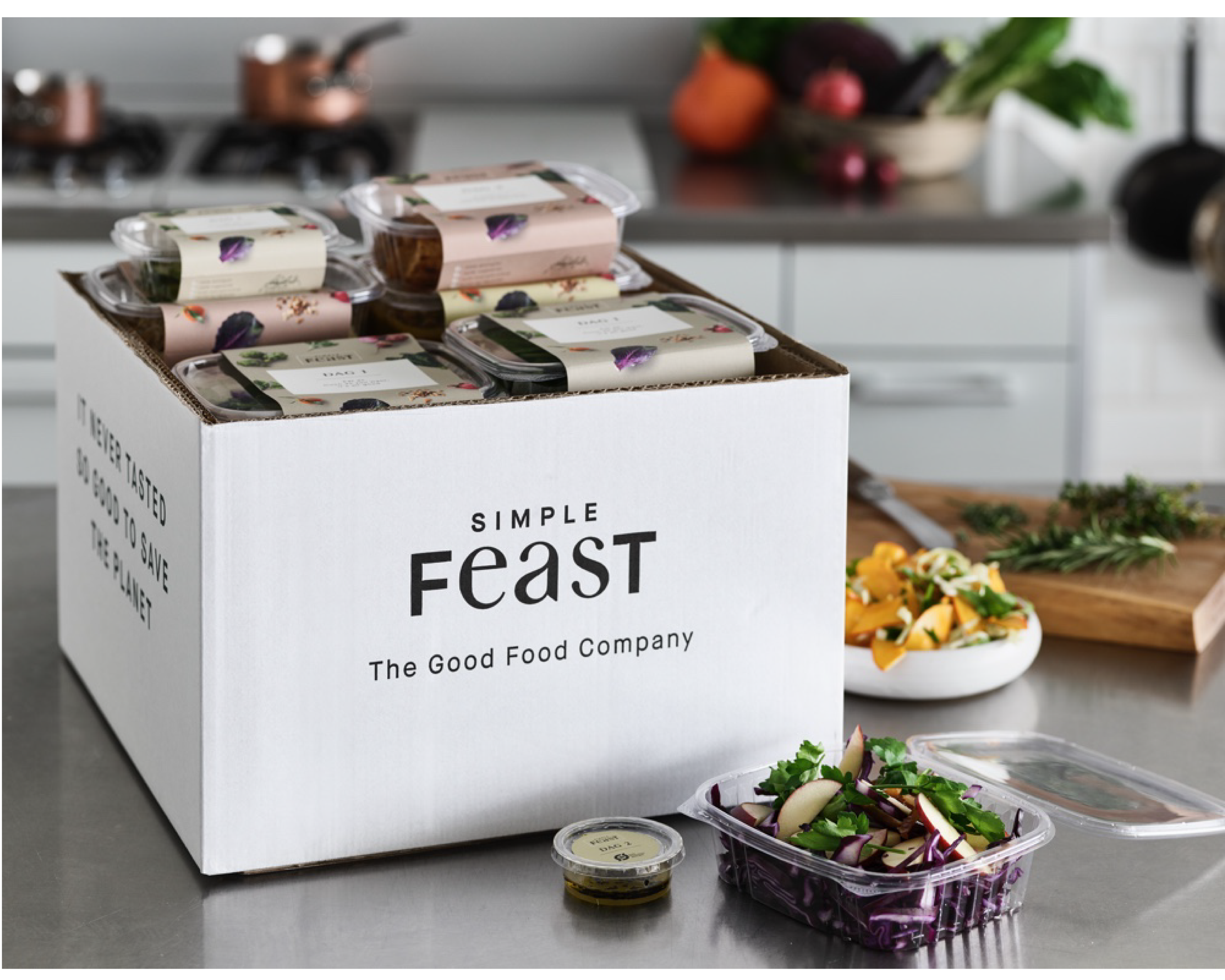
Simple Feast operates as an online cookbook platform. Aside from this, they also offer plant-based food that is sustainably produced and organic, delivered straight at consumer's doorstep. At Simple Feast, they offer Weekly Boxes and Comfort Food Boxes. Weekly Boxes are three nights of entire vegetarian or vegan meals that require a few steps of preparation. Comfort Food Boxes are monthly offerings of 4 to 8 complete jarred meals that only require heating up and your favorite side dish.
Founded in 2015 by Jakob Jønck and Thomas Ambus, the company is headquartered in Copenhagen, Denmark.
THE BRIEF
This project aimed to create a client portal for the customers of the Simple Feast plant-based food delivery service. We wanted to provide our clients with an overview of their monthly spending and the environmental impact. This was done in order to align with our core values and continue being 100% transparent as an organization.
THE GOAL
As a product designer and UX researcher, I conducted user interviews and surveys to better understand the target audience's preferences and behaviors. Based on this research, I identified some of the key features that should be included in the profile page to meet the client’s expectations.

HERE IS HOW I PLANNED AND ORGANIZED MY RESEARCH:
- Screen captures: I took a series of screenshots from the legacy version of the app. This activity helped me with my Heuristic Evaluation, as I wanted to optimize usability by minimizing design deficiency.
- Competitor analysis: I compared Simple Feast with at least 6 similar food-delivery companies based in the US and in the EU.
- Interviews with our users: I created a list of questions for our clients in order to understand their needs, what they expect as consumers, companies they liked before, apps that they normally use when ordering food online, etc.
After the first phase, I was able to proceed to the next steps.
- Users personas: from the research and the analysis of the responses, I designed two different user personas: one representing a single customer living in an urban area, and a parent living with their family in the suburbs.
- Feature prioritization: after meeting with the team, we decided to focus on improving our checkout page, and the management page for customers.
RESEARCH METHODS
Business Analysis
Business Compar.
Market Gap Analysis
Interviews & SME
Sorting Card
Heuristic Evaluation
Prototyp.
Affinity Diagram
Feature Prioritizat.
User Persona
User Flow
Design Critique
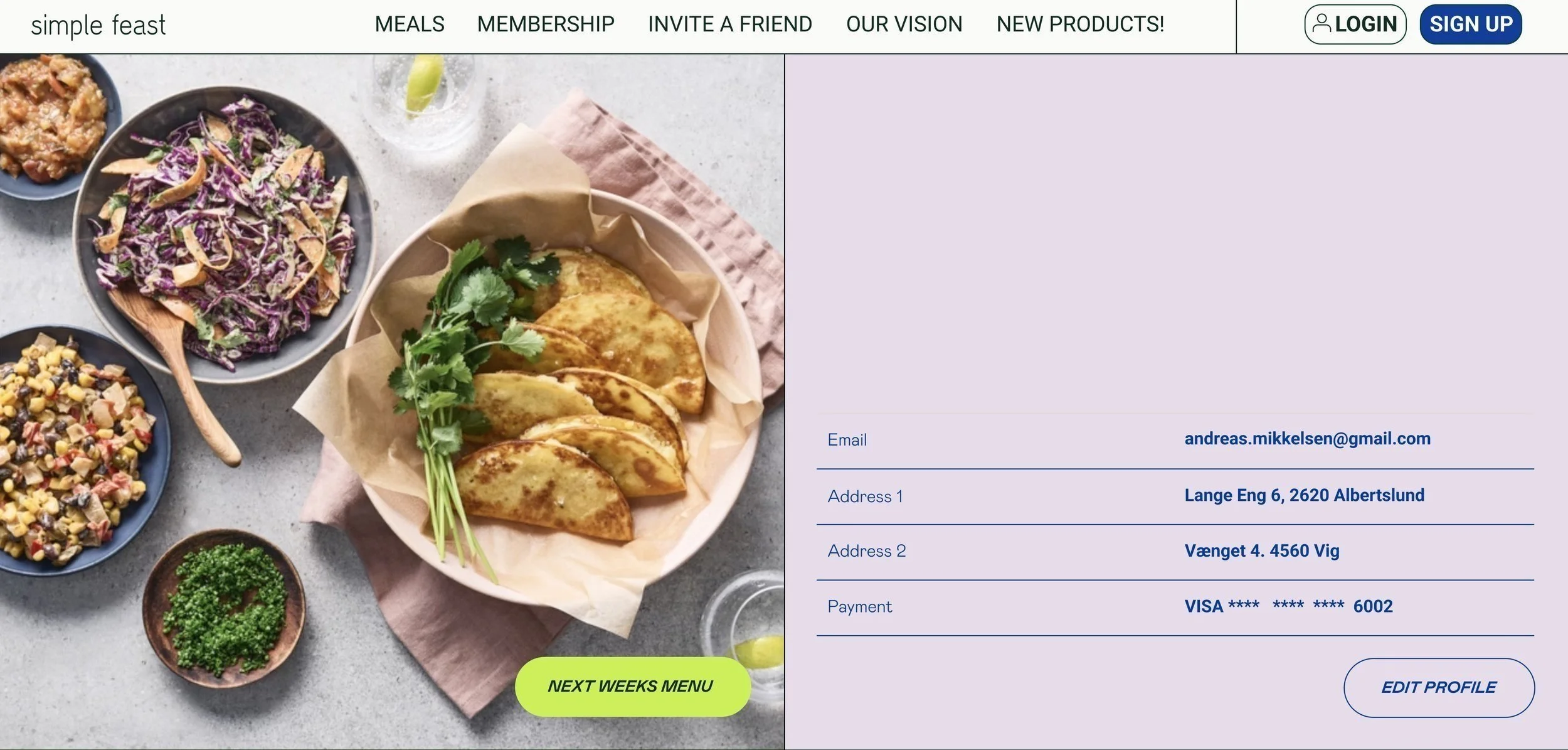
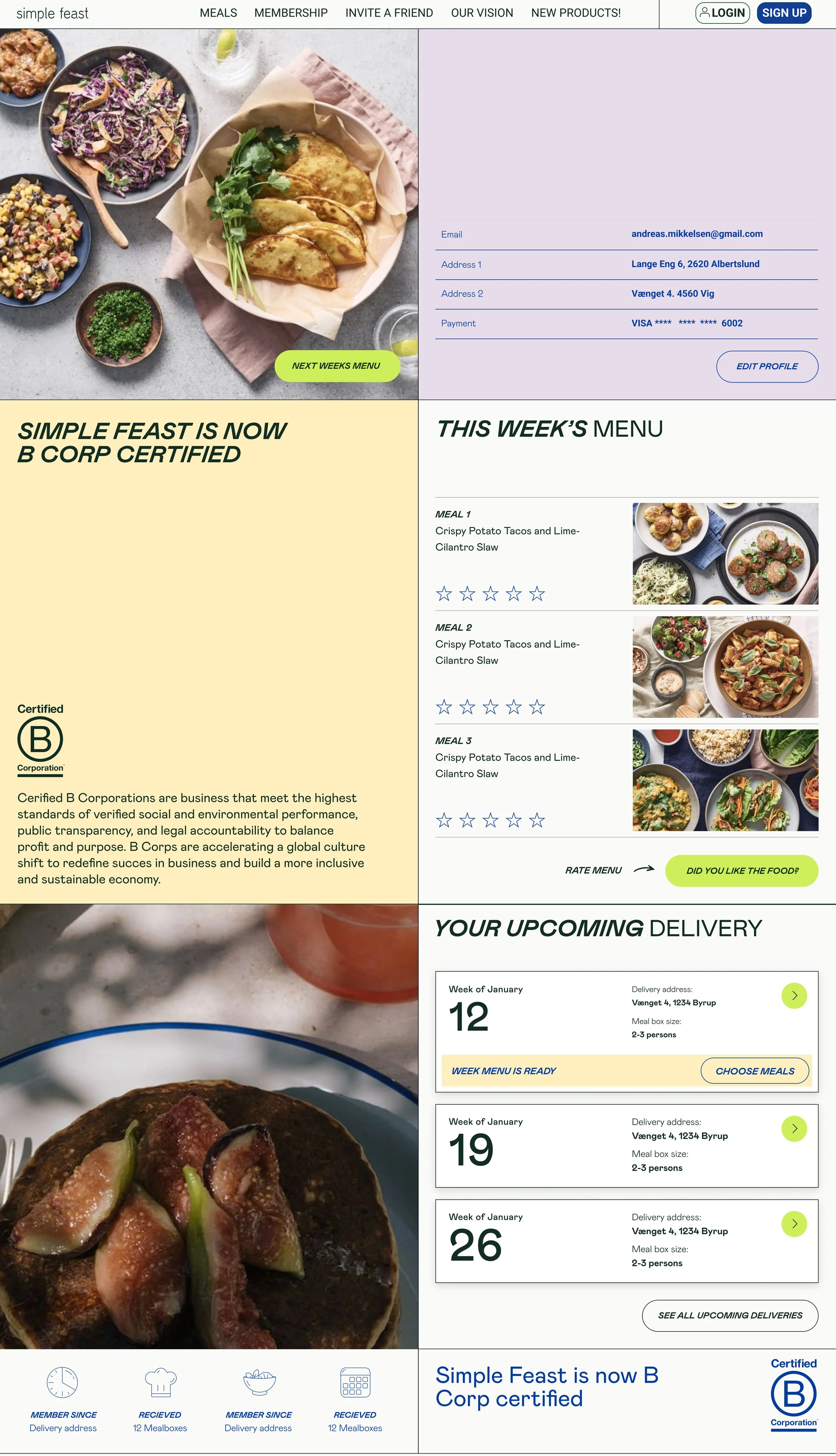
Once the research was finalized and shared with the rest of the team, I started prototyping and designing the checkout page, login page, and management account for customers.
MEMBERSHIP HOMEPAGE
hover reveal
MY ORDERS
RATING OPTION
CONCLUSION
Our clients were able to easily see how much they were spending on a monthly basis and also make any modifications whenever needed. Also, it was a way for us to be 100% aligned with our mission and our values toward our impact on the planet. I designed:
Graphs and charts: As always, visualizing data can help users understand it more easily. Including graphs or charts that show spending over time, trends, or comparisons to previous months helped users track their expenses more effectively. These graphs were designed in an easily comparable way, where through a plant or a jar of water, clients could see their positive impact on the planet when purchasing a Simple Feast box.
Personalized recommendations: we also designed a personalized recommendations section based on the user's spending habits could be a valuable feature. For example, if a client was selecting the same box weekly, we were offering discount codes or any other product to match the food that they were purchasing.
Once I identified the key features of the profile page and created the mockups and the wireframes, it was time to present the ideas to the team and get feedback in order to make the right changes and take some design considerations.
In a conclusion, designing a client's profile page to track expenses required a deep understanding of the user's goals and needs, as well as careful consideration of the visual design and features and the mission and the vision of the company. By incorporating user feedback and staying up-to-date with best practices in UX/UI design, I managed to create a profile page that met the user's needs and provided a positive experience for the user.
CREDITS
I also supported the team in redesigning the App Store assets.


