PROJECT OVERVIEW
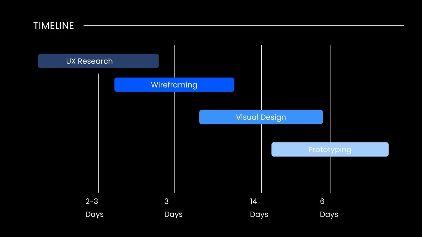
TIMELINE
3 months
MY ROLE
UX Researcher, Product Designer
TOOLS
Figma, Maze, InDesign, Figjam
ABOUT THE COMPANY
Defiance Capital is a venture capital firm that focuses on early-stage investments in technology companies. Defiance Capital primarily invests in companies that are involved in sectors such as artificial intelligence, robotics, and virtual reality. The firm is known for its active involvement in its portfolio companies, providing not just capital but also operational and strategic support.
PRODUCT VISION
This project aimed to create:
A modern, professional design that reflects the firm's brand and values.
Improve user experience and navigation to help founders find the information they need quickly and easily.
Develop a clear and concise messaging strategy that communicates the firm's investment thesis, philosophy, and track record.
Optimize the website for search engines to attract more visitors and improve visibility. Incorporate interactive elements such as videos, infographics, and other media to engage visitors and showcase the firm's portfolio companies and investment strategies.
Incorporate calls-to-action (CTAs) that encourage visitors to engage with the firm, such as filling out a contact form, subscribing to a newsletter, or scheduling a meeting.
Ensure that the website is secure, up-to-date, and complies with relevant regulations and guidelines.
THE GOAL
When redesigning Defiance Capital’s website, I aimed to create a website that effectively communicates the firm's unique value proposition, investment philosophy, and track record to potential investors, entrepreneurs, and other stakeholders. I also decided the website should have a professional, modern design that reflects the firm's brand and creates a positive user experience. It should also be optimized for search engines and mobile devices.
HERE IS HOW I PLANNED AND ORGANIZED MY RESEARCH:
- Screen captures: I took a series of screenshots from the legacy version of the website. This activity helped me with my Heuristic Evaluation, as I wanted to optimize usability by minimizing design deficiency.
- Competitor analysis: I compared Defiance Capital VC with 10+ similar venture capital companies based in the US and the EU.
- Previous website analysis: This was an important part of the redesign process as it provided valuable insights into what worked well and what needed improvement. This information helped me to ensure that the new design would be more effective in achieving its goals and providing a better user experience.
After the first phase, I could proceed to the next steps.
Design and prototyping: I created a site map and wireframes, maintained the same structure as the previous website (as requested by the client), and designed the interface (visual style, typography, color schemes, and graphic elements).
- Test: I refined the designs based on the users’ feedback and gathered feedback on the website’s usability and functionality.
PROBLEM
The company realized that they needed to revamp their website to better communicate their mission, values and unique selling points to their users (USPs). They wanted the website to be more modern and user-friendly.
SOLUTION
My redesign solution included the following objectives:
1. To focus on creating a user-friendly interface that highlights the company mission, values, and USPs.
2. To design a website that was easy to navigate.
3. To include visuals that clearly communicate the company's message and values.
4. To create a website optimized for desktop and mobile devices so users can access it from anywhere.
PROTOTYPING
With attention to detail, I crafted a comprehensive prototype that encapsulated the essence of Defiance Capital's vision and values. This prototype served as a dynamic representation of the website's layout, functionality, and user experience. It reflected my commitment to excellence in design and innovation. I invite you to explore the prototype on Figma here, where you can see firsthand the seamless integration of form and function.

STYLE GUIDANCE
TIMELINE
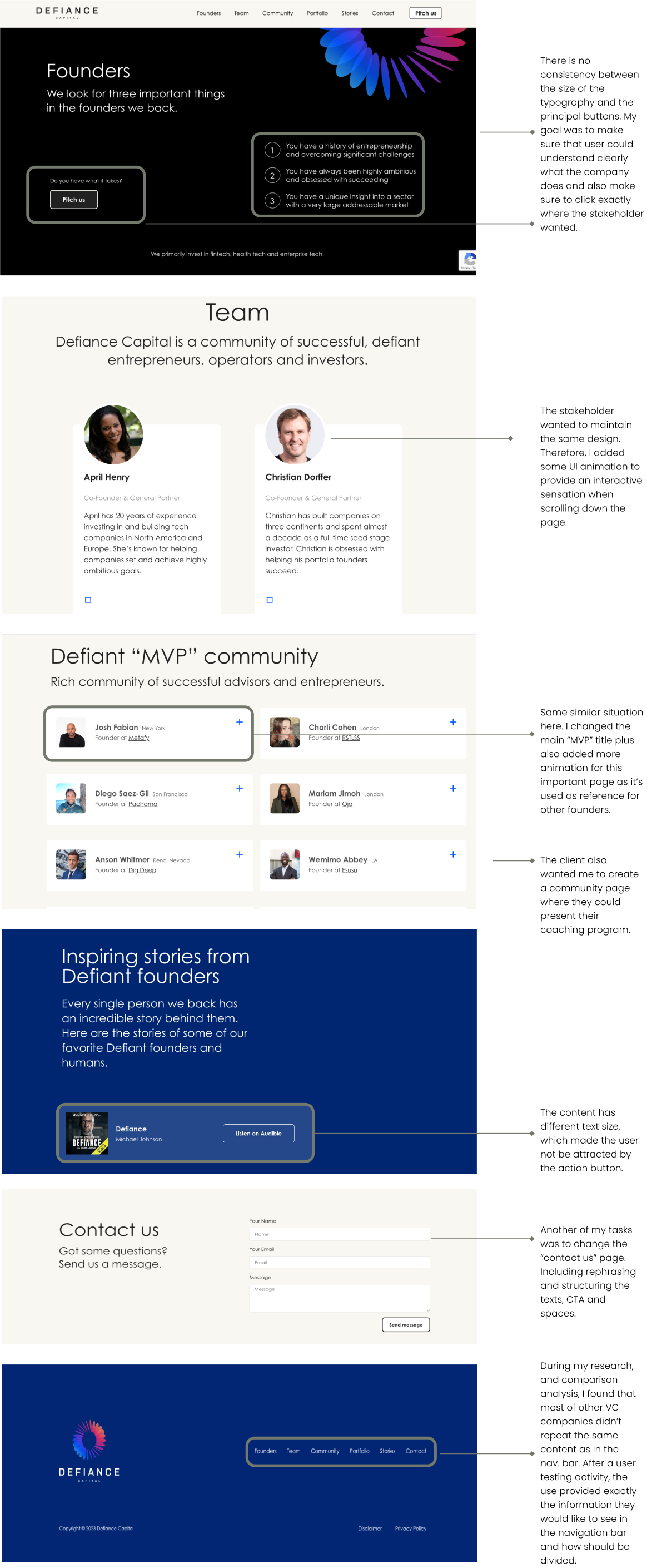
PREVIOUS WEBSITE DESIGN
NEW WEBSITE DESIGN
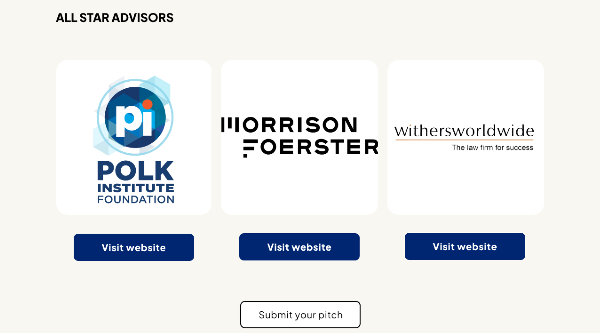
OTHER SCREENS
CONCLUSION
My goal in redesigning the client's website was primarily to enable founders and investors to navigate it more easily and in a user-friendly manner, incorporating a clean and modern aesthetic. I received positive feedback from both clients and users about the new design. The consistency in the design helped position this Venture Capital firm as a trusted and reputable player in the industry. The enhanced navigation and functionality also made it simpler for companies and founders to pitch and become part of the portfolio companies.
